Monday, 15 February 2016

Sunday, 14 February 2016
Question 1
In what ways does your media product use, develop or challenge forms and conventions of real media products?
Music Video
Style:
Most indie bands, such as Interpol and Editors, have videos with fast cuts and quick tempo, these videos want to advertise their band and ignore entertaining.
Our song is slow and melancholy which encourages us to concentrate on Mise en Scene and to ignore pace and editing, the shot length can fluctuate as long as the image is powerful. Our slow theme will conform to many conventions in films and documentaries but will subvert from the fast cuts of indie videos like Editors or Interpol.
We also made a Steelomatic to show our influences and inspirations of our product:
Genre Conventions: From the research and planning labels you can see that we looked at other videos in our indie genre, we took inspiration from the 1975 videos, with black and white moody performances and conceptual narrative, the creative shots in Cough Cough by Everything Everything inspired our product as we used a number of unusual shots such as the underwater worms eye view. We were able to subvert from modern indie videos into a natural river setting similar to the location of Somewhere Only We Know by Keane. This natural location challenges black and white conventions in the genre and creates our own image. We imagined that our band would have a strange and alternative theme, we used the bath and the blood to promote this idea and give our brand individuality which is difficult in the indie genre as a number of bands try to escape trends in their videos.
Narrative: When researching other videos like Come with me know by KONGOS, narrative generally cuts between performance and narrative, this gives the video a story element but still differentiating the video with the concept themes. We decided to conforms to these conventions as we were able to challenge video themes with camera angles and mise en scene. Therefore our videos is a mixture or performance shots in the river and conceptual scenes in the bath and underwater.

Performance

Concept
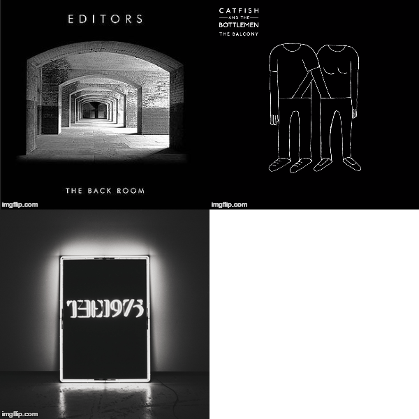
Below are examples of other real life products, the black and white theme runs consistently and we were inspired b the simple but creative colours. One example is catfish and the Bottlemen, with a simple stencil which has as powerful and controversial message. These covers, such as the XX is simple but has a strong synergy with their logo, website and advertising campaign.

Below is a YouTube video that shows annotations of our digipak as well as comparing it to other real media products.
This is a Photobucket showing the research into similar bands websites. The popular themes in these websites are the simplicity, most of the front pages have just the album cover and a link to social media outlets, we were able to challenge this convention by creating an interesting sea background that links to the water theme of our video.
This website lay out had ideas i wanted to incorporate into the website i am currently making. The website keeps all navigation around the website at the top of the page above a picture/video of the band. I liked the idea of this website deign as it highlights similar areas in which our band is also trying to get across. The dark background used here could give off dark themes to the band and connects to our concept thought process. We have looked to keep our website simple to add effect to it like you can see in the artic monkeys site below.


It is important that a band website has purchasing opportunities for fans which will make the band money from merchandise such as t-shirts and mugs. Another important element is interactivity such as buttons and links to social media and videos. We have used many conventions in a product as we have concentrated on buttons and simplicity.
In summary we have used conventions with regards to the website and the link between narrative and concept, however we challenged conventions with our mise en scene and the digipak. Black and white theme is common in the digipak which we developed in our products by incorporating colour and different levels of saturation. The video subverts conventions with the shot length and the editing style.
We also made a Steelomatic to show our influences and inspirations of our product:
Genre Conventions: From the research and planning labels you can see that we looked at other videos in our indie genre, we took inspiration from the 1975 videos, with black and white moody performances and conceptual narrative, the creative shots in Cough Cough by Everything Everything inspired our product as we used a number of unusual shots such as the underwater worms eye view. We were able to subvert from modern indie videos into a natural river setting similar to the location of Somewhere Only We Know by Keane. This natural location challenges black and white conventions in the genre and creates our own image. We imagined that our band would have a strange and alternative theme, we used the bath and the blood to promote this idea and give our brand individuality which is difficult in the indie genre as a number of bands try to escape trends in their videos.

Performance

Concept
Digipak
Below are examples of other real life products, the black and white theme runs consistently and we were inspired b the simple but creative colours. One example is catfish and the Bottlemen, with a simple stencil which has as powerful and controversial message. These covers, such as the XX is simple but has a strong synergy with their logo, website and advertising campaign.
Below is a YouTube video that shows annotations of our digipak as well as comparing it to other real media products.
Website
This website lay out had ideas i wanted to incorporate into the website i am currently making. The website keeps all navigation around the website at the top of the page above a picture/video of the band. I liked the idea of this website deign as it highlights similar areas in which our band is also trying to get across. The dark background used here could give off dark themes to the band and connects to our concept thought process. We have looked to keep our website simple to add effect to it like you can see in the artic monkeys site below.


Our simple tour page complies with simple page conventions, the idea is that the information is the exciting not the layout.

The gallery page has general conventions as there are only a limited number of ways to display pictures, this suggests our page conforms with gallery page conventions.
It is important that a band website has purchasing opportunities for fans which will make the band money from merchandise such as t-shirts and mugs. Another important element is interactivity such as buttons and links to social media and videos. We have used many conventions in a product as we have concentrated on buttons and simplicity.
In summary we have used conventions with regards to the website and the link between narrative and concept, however we challenged conventions with our mise en scene and the digipak. Black and white theme is common in the digipak which we developed in our products by incorporating colour and different levels of saturation. The video subverts conventions with the shot length and the editing style.
Saturday, 13 February 2016

Friday, 15 January 2016
Thursday, 14 January 2016
Using new software - Powtoon
For the evaluation question James is using 'Powtoon' to present it. This is a new format that he hasn't used before. I feel that this is a good thing however, as it shows James's ability to adapt to new programmes and use them sufficiently.
Powtoon has many choices of animations and text effects that James has used to help emerge the audience into the presentation. This software is similar to PowerPoint however it is more interesting and interactive.
Here is a screenshot of the layout of this presentation software

Powtoon has many choices of animations and text effects that James has used to help emerge the audience into the presentation. This software is similar to PowerPoint however it is more interesting and interactive.
Here is a screenshot of the layout of this presentation software

Friday, 18 December 2015
Final Digipack

After some serious thoughts we decided that we still weren't happy with the digipack so we decided to change it, adding a few different images in it. As we are an Indie band it is essential to keep the black and white theme running throughout the digipack so we made sure we kept ever panel in black and white. We made sure we mentioned a special thanks to all the people that helped make our album as it further enhances the professional edge to our production. The song list was changed as previously we didn't like the font used as it was extremely hard to understand and also it wasn't positioned center of image. The CD cover was changed as previously it was too basic as there was just an image off of Google images of the sea, making it look easy and babyish. Whereas in this one Will used Photoshop to create a mist going over the CD, showing a lot more creativity and originality.
Subscribe to:
Posts (Atom)